
Director of User Experience @ Indiegogo
INTRODUCING ITEMIZATION AND IMPROVED PERK MANAGEMENT
Introducing a new way to create, manage, and itemize perks during crowdfunding campaigns.
Introducing a new way to create, manage, and itemize perks during crowdfunding campaigns.
Indiegogo is a crowdfunding site based on a marketplace model. Campaigners launch and manage campaigns to raise funds for their ideas and backers support these campaigns by making financial contributions in return for “perks” or products that will eventually be shipped to them. Once a campaign has ended, campaigners shift their focus from raising funds to fulfilling orders and delivering the perks promised to their backers.
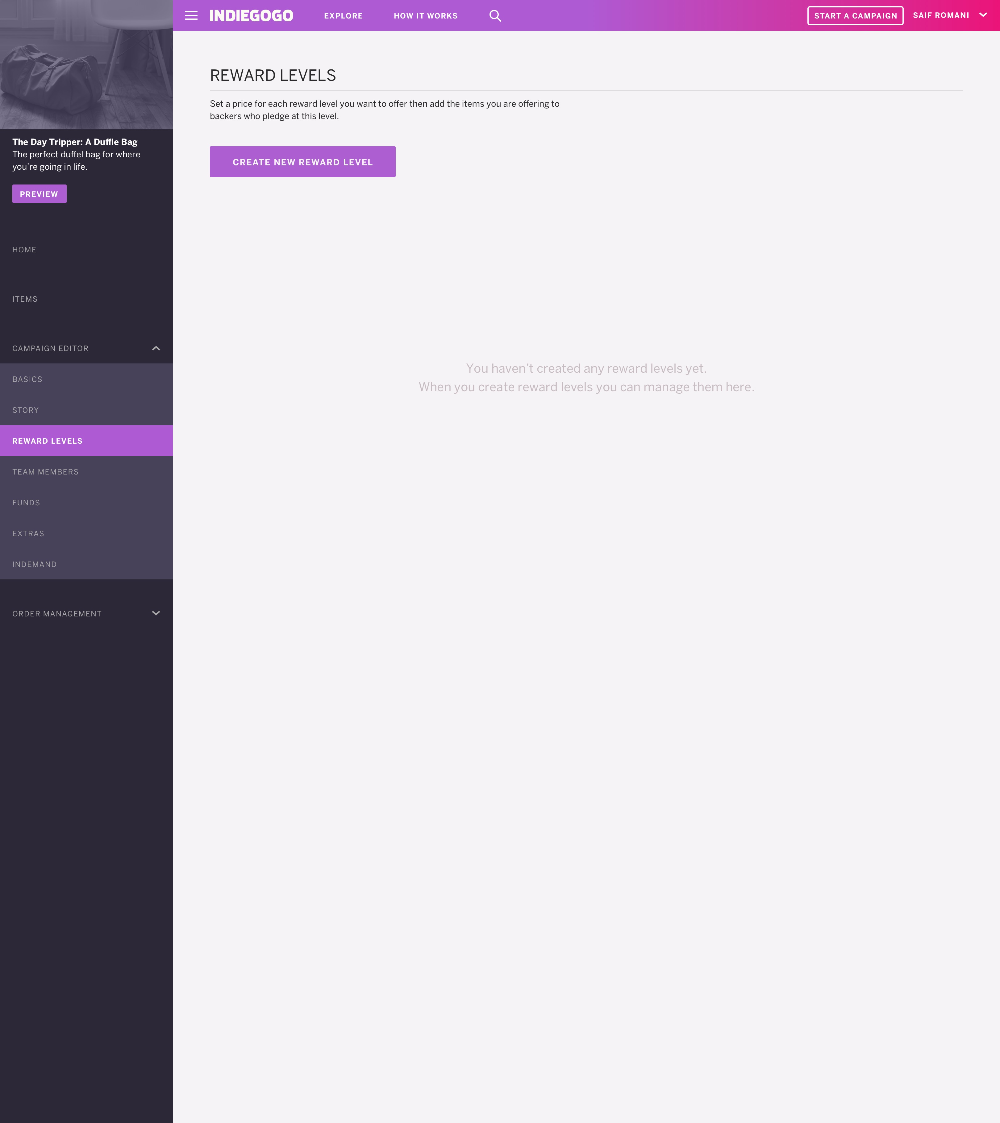
No ability to itemize perks
One of the biggest challenges campaigners face when it comes fulfilling orders is not being able to breakdown each order into the individual items that have been promised within the claimed perks. The primary reason for this is that when creating perks, campaigners enter unstructured text to describe a perk. Some perks may be a single product or item, while other perks can be multiple items. When it time is to deliver a perk at the end of a successful campaign, campaigners have to manually keep track of what is promised within each perk.

Because of this inability to itemize perks, many campaigners used other third-party services or products to export all of their orders from Indiegogo, as these services allow for simple itemization of perks.
Itemization during perk creation
Our strategy was to introduce items as meta-data during the perk creation process. Our hypothesis was that it would simply fulfillment for campaigners once they are in the order management phase of their lifecycle, and would eliminate the need to use other platforms for such services.
As Director of User Experience I was responsible for every aspect of the final solution from start to finish, where I lead each of the following phases:
Product Vision and Stakeholder Buy-in
Ideation and Solution Design
Prototyping and Usability Studies
Solution Refinement and Visual Design
Lifecycle-centric product vision
As I began thinking about improving the order management experience for Indiegogo campaigners, I took a step back for a more holistic look at the entire lifecycle of a campaigner on Indiegogo. Taking a "lifecycle" view of the campaigner experience meant looking beyond just the campaigning phase and understanding the user’s goals across the entire experience of defining their idea, connecting with their audience, raising funds (via campaigns), managing orders received, taking pre-orders for their product, manufacturing their product, and eventually shipping their product to market.

Having understood the key pain points in the context of the user goals, I began sketching high-level concepts that would eventually define our product roadmap. We focused on improving the order management experience by introducing the concept of itemization. I also identified key product improvements that were not only essential to the success of itemization, but were necessary to execute the long-term vision for the entire experience on Indiegogo.
My first goal was to get cross-team alignment and buy-in from all interested project stakeholders, prior to designing the specific solution and building prototypes for usability studies. I lead a series of future-state design sessions where I shared the the details of itemization as well as other details such as improving our navigation. My goal was to show how all of these features help Indiegogo make the shift from a "campaign-centric" product to a "lifecycle-centric" product suite.


Scope definition
Once we had alignment on the long-term vision and product plan from product managers and team leads, we defined the scope of this first product iteration to address the following areas:
Campaign navigation system
Itemization of perks
Overall visual design iterations of campaign editor experience
Using a new navigation menu pattern
The concept of creating items as part of the campaign creation experience was just part of a larger strategy and vision of new features and improvements for our users. But in order for us to roll out new sections and areas of the campaign editor without confusing the user, we needed a scalable navigation system.
The previous version of the campaign editor maintained multiple navigation patterns for navigating between campaigns and across the various steps with the campaign editor. It was an information architecture that wasn't properly planned and evolved organically to accommodate the fast-paced rollout of new features. It also relied on a horizontal navigation bar with menu items spanning left to right which didn't scale well as we planned to rollout new sections of the campaign creation and management experience.

I designed a new navigation pattern that introduced a sliding left navigation menu. This menu combined the previous horizontal bar along with the left navigation tabs of the campaign editor sections.

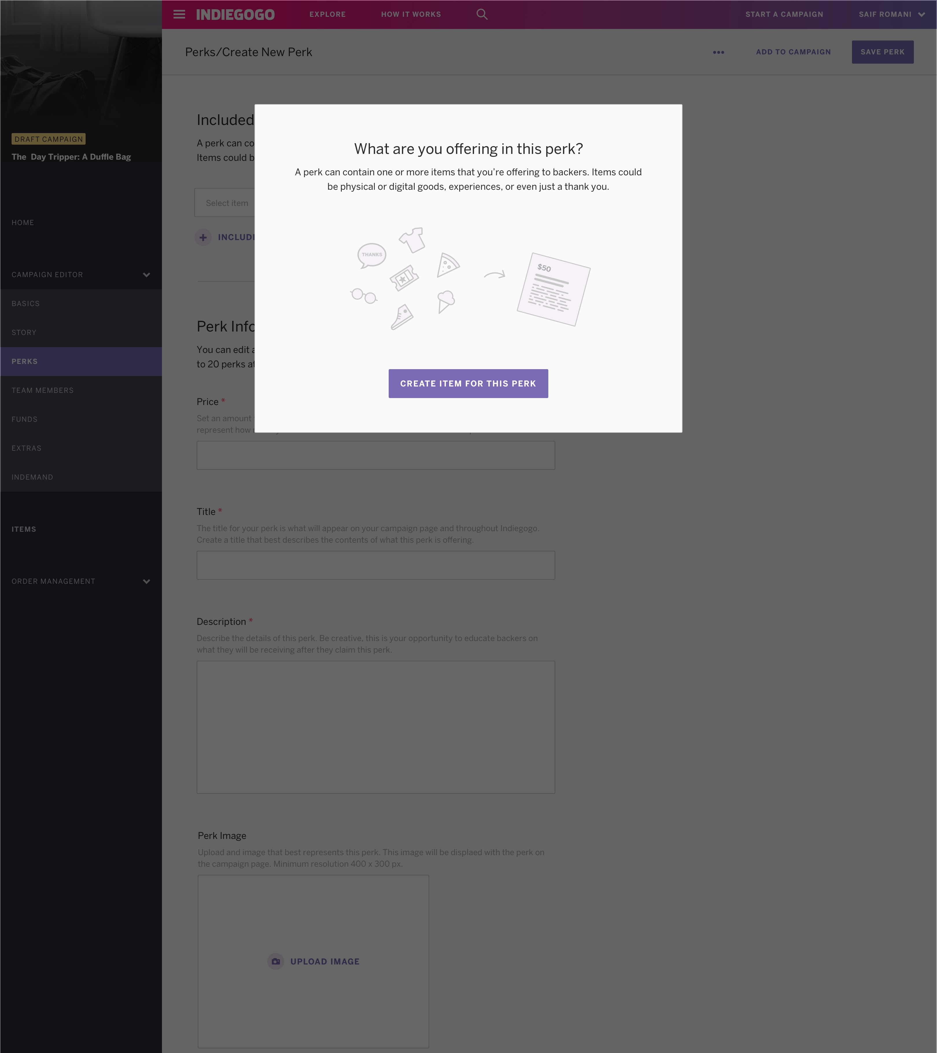
Creating items and perks
By introducing items, campaigners can now create items independent of a perk. Items are simply the things a campaigner is offering, and the perks become the container or bundle that is published on a campaign page for backers to claim. By maintaining a separate items list, items could be reused to create multiple perks. In the example below, the same items are reused to create the tri-pack perk and the bundle perk. The added benefit of this model is that when campaigners make an edit to an item, the changes are reflected across all perks that contain that item.


Prototypes and in-person usability sessions
At Indiegogo, the design team consists of both product designs and user researchers who partner and collaborate to develop the overall research strategy, conduct usability sessions, and synthesize key findings and insights to iterate and improve the product design.
Once I had created designs of the new campaign editor experience, we conducted 4 different rounds of in-person usability sessions; each round consisting of 4 - 5 research participants. We built hi-fidelity clickable prototypes and structured the usability sessions to help us answer the following questions:
Relationship between items and perks. Do people understand the difference between "items" and "perks"? In the past, people only created perks and worried about itemization later. Would introducing items earlier in the process confuse users?
Correct terminology and labels. What are the correct labels and terminology to use? Is "items" the correct term to use? What about using "reward levels" instead of "perks"? What other terms will serve our users better?
Interaction design details. When users switch from creating perks to creating items, is the transition clear to them? Are they aware of what just happened? Would a modal serve this purpose better?
Insights from initial usability sessions
The first design pass gave campaigners the flexibility to either start with items first, or create perks and later add items. If users did go down the path of creating perks, the interaction model allowed them to create items from within the perk, but users would be taken to the item section of the editor to do so. This completely confused users and prevented them from completing the task of creating a perk on the campaign page. This design iteration only tested well with sophisticated users who had commerce experience and understood the difference and value of creating items.


Subsequent iterations and refinement
The next iteration introduced more guided content. We introduced a pop-up modal that would guide users in creating an item first, even if they chose the path of creating a perk. While this improved the success rate of users creating perks, they still didn't understand why they had to create the item first. When asked to go back and edit an items inside a perk, users were still confused about the difference between the two.


Final designs
Our final design took into account a number of the user insights we gathered during the multiple usability sessions. We realized that although itemization is valuable to campaigners, most campaigners are too focused on creating and launching their campaign. In this design iteration, we streamlined the flow of creating items within perks. We used better content and leveraged empty state pages to educate users about what to do next. We reduced confusion by only giving users one path to follow: creating perks and items inside of each perk. By rearranging the fields in the perks page, we helped users understand the relationship between items and perks.


My design process of understanding the lifecycle goals of users and exploring solutions that target the most pressing needs, has helped shape the long-term roadmap at Indiegogo. We've introduced key features that not only improve the user experience, but unlock capabilities for us to continue building great experiences.
We were able to design and build an improved product for campaigners that not only increased the launch rate of campaigns created on Indiegogo (compared to the older version of the campaign editor), but allows campaigners to itemize their perks with minimal effort. This feature improvement will not only make creating and managing campaigns easier, but will improve the way users manage their fulfillment orders after their campaign has ended.